To be seen
Merkur
Branding / Corporate Redesign
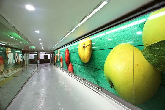
Apples have always been the trademark of MERKUR. For the 2015 repositioning of the brand core of MERKUR, which is reflected in communication as well as in the markets, the key visual of Büro X was also redesigned and redesigned.
The green wood – the MERKUR CI colour – and the colourful apples create a high-impact image of the food company, which conveys joie de vivre and pleasure. The striking independence and visual impact from afar of the new image serve the locations of the stores and the moving fleet of trucks.
Branding
